| « Principal component analysis (PCA) |
Introduction to the user interface
The majority of the program's functionality can be started from the menu. In the File menu datasets in csv file format
can be loaded, images of the current visualization and selected data items as csv files can be exported.
From the menu Applications the linked 2D scatterplot and the outlier detection applications can be started.
The menu View provides dialogs to steer the colors and the axis setup of the parallel coordinates.
In the menu Tools the statistical functions (clustering, PCA, distance calculations) can be called.
In the following sections the dialogs of the menus Applications,
View and Tools are explained.
Colors of the visualization
The way how the data points are colored in the visualization can be steered via the menu View / Coloring.
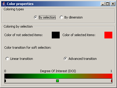
Picture 9: color dialog - By selection
In the panel Color types it can be decided whether the data items are colored according to a selection or according to their
values in a specified dimension.
When the data items are colored according to a selection, it is possible to specify the colors for selected and non
selected data items, by right clicking on the color rectangles. For data items with a degree of interest (DOI) between
0 and 1, a color gradient can be specified. Linear transition defines a color gradient between the color of
selected the color of non selected items. With the option Advanced transition it is possible to define color
points at any position on the transition by a double click. With a double click on a color point it can be deleted
again. With a right click on a color point its color can be modified. It is also possible to move the color points.
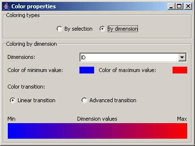
Picture 10: color dialog - By dimension
If the option By dimension is chosen, then the dimension can be specified whose values are used to define the colors
of the data items. Apart from that the same configurations as with the option By selection can be made. But instead of
the color of selected and non selected items the color for data items with the maximum and the minimum value in
the specified dimension can be set. The color transition in between can be configured as outlined above.
Axis management for parallel coordinates
The menu View / Axis management opens the properties of the axis of the parallel coordinates visualization.
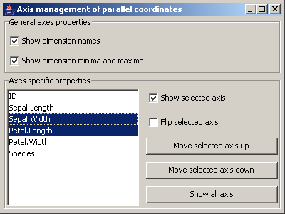
Picture 11: Dialog for the axis management of the parallel coordinates
In the first panel general axis settings can be made:
- Should the dimension names be shown?
- Should the minimum and the maximum values of the dimensions be shown?
In the section Axes specific properties for the selected axis, their visibility and their orientation
(minimum at bottom or at the top) can be set. Additionally the selected axis can be moved up in the
display order by clicking the button Move selected axis up. With the button Move selected axis down
the selected axis are moved backwards in the axis order.
The button Show all axes sets all axis visible.
Clustering
The menu Tools / Clustering opens the properites of the k means clustering.
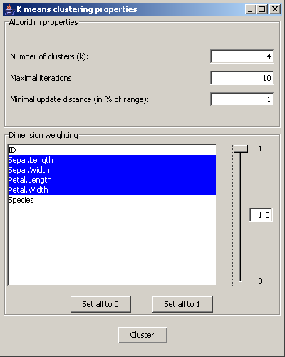
Picture 12: Dialog for the cluster settings
In the section Algorithm properties the number of clusters, the maximum iteration number and the
minimum update limit can be set. The minimum updated limit is set in percent of the range of
values of the data items.
In the Dimension weighting panel the dimensions that are relevant for the clustering are chosen.
For each dimension a weight between 0 and 1 can be set, that determines its importance for the clustering.
The button Cluster starts the clustering algorithm and adds the clustering results to the dataset.
Principal component analysis (PCA)
The settings for the PCA can be opened by the menu View / Principal Component Analysis.
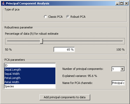
Picture 13: Dialog for the pca settings
In the panel Type of pca it is set whether the classic pca is used or a robust estimate of the
covariance matrix should be calculated. If the robust version is chosen, the user can set the
percentage of the data on which the robust estimate should be based.
In the section PCA parameters the relevant dimensions for the pca are chosen.
In the field Number of principal components it can be set how many principal components should be
added to the data. According to that number the variance in percent that is captured by those components
is shown. Finally a name for the principal components can be set.
The button Add principal components to data adds the principal components to the dataset.
Distances
The menu Tools / Distances opens the settings for the distance calculations.
For those calculations properties can be set as shown above for the PCA.
Either the Mahalanobis or the robust distances are added to the dataset. The distance calculation only considers
the selected dimensions.
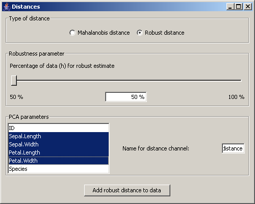
Picture 14: Dialog for the distance settings
Outlier detection
The menu Applications / Outlier Detection starts the application to detect extreme data items in the dataset.
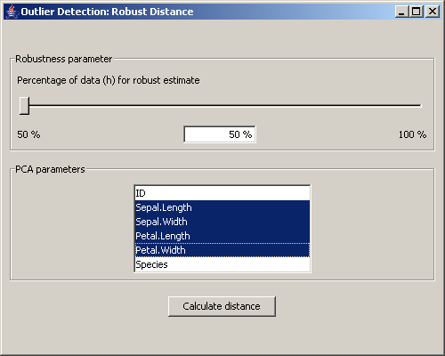
Picture 15: Dialog for the outlier detection
At first a window for the calculation of the robust distance is opened. This dialog is the same as the one for the distances, with the difference that it is not possible to choose the Mahalanobis distance. Instead of adding the distance values to the data, they are visualized in a special scatterplot that can be seen in picture 16.
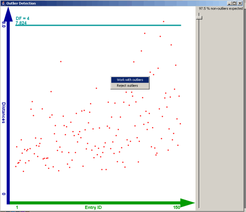
Picture 16: View of the outlier detection
In this scatterplot the ID of the entries of the dataset is shown on the X axis.
On the Y axis the robust distances are plotted.
A horizontal line shows the decision boundary that divides outliers from "normal" data items. This boundary can be moved by
a slider on the left side of the scatterplot. The position of the slider defines a quantile of the chi squared
distribution with p degrees of freedom, where p represents the number of dimensions that were used for the
calculation of the robust distance.
By a context menu on the scatterplot the analysis can be continued with the
outliers or alternatively with the "normal" data
| « Principal component analysis (PCA) |