A program written for the lecture
Informations visualisation (summer term 2004)
Michael Wohlfahrt, 9825026
Jürgen Platzer, 0025360
| « Possible new features |
Comparison: visualization of time-dependant data
On this page several ways to visualize time-dependant data are compared. For this task a dataset with the
mean amount of rain measured in mm per month of 5 cities is used.
The cities are ordered according to the total amount of rain per year.
(Source: Geographie kompakt 1, 1. Auflage 1993)
Download of the dataset in the format for the ThemeRiver application
| Month / Cities | Innsbruck | Moscow | Cape town | Upernavik (Greenland) | Cairo |
|---|---|---|---|---|---|
| January | 57 | 31 | 12 | 9 | 4 |
| February | 52 | 28 | 8 | 11 | 5 |
| March | 43 | 33 | 17 | 9 | 3 |
| April | 55 | 35 | 47 | 11 | 1 |
| May | 77 | 52 | 84 | 11 | 1 |
| June | 114 | 67 | 82 | 9 | 0 |
| July | 140 | 74 | 85 | 21 | 0 |
| August | 113 | 74 | 71 | 24 | 0 |
| September | 84 | 58 | 43 | 30 | 0 |
| Oktober | 71 | 51 | 29 | 23 | 1 |
| November | 57 | 36 | 17 | 17 | 1 |
| December | 48 | 36 | 11 | 11 | 8 |
| Table 1: dataset for the comparison | |||||
ThemeRiver visualization
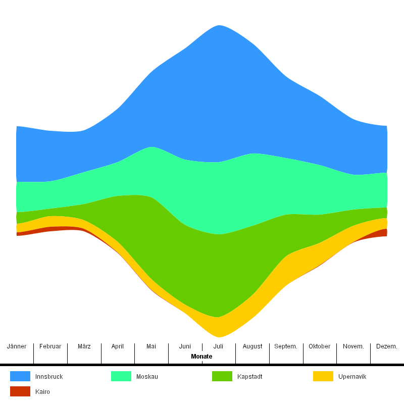
Picture 6: ThemeRiver visualization
In the ThemeRiver visualization it can be seen that the total amount of rain in the months June, July and August is very high, while in the winter months it is significantly less. Additionally strong deviations between the values of summer and winter months for Cape town can be detected, because the river is very thin in January and December, while it is wide in June, July and August. In opposite to that Upernarvik has constant amounts of rain over the whole year. For Cairo it can be seen that the river disappears in summer.
Bar diagrams
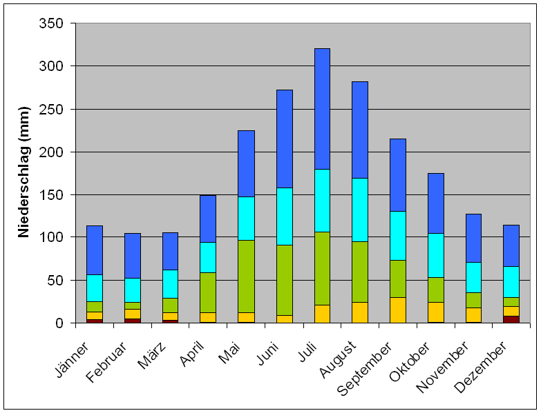
Picture 7: Bar diagrams
The first comparison will be made with bar diagrams, which are also mentioned
in ThemeRiver papers. Here the values of the attributes are drawn one upon the other
on a bar per point in time. The colored sections correspond to the widths of
the rivers. The same attributes show the same colors in both visualizations.
In the bar diagram the total amount of rain can be seen better. Also the
outlier Cairo and the deviations of Upernarvik are visible.
For the attributes at the bottom of the bars the correlations over time
can be examined very well. For the attributes at the top of the bars this
task is more difficult, because the colored sections of one attribute are shifted.
Strong deviations over the time can also be detected, but not as good as in
the ThemeRiver visualization. Especially for small values at the tops of the
bars, this can not be easily seen.
Visualisation with parallel coordinates
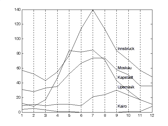
Picture 8: Visualisation with parallel coordinates
With the parallel coordinates for each month the city with the highest amount
of rain can be detected. So the ranking as well as the trends of the
cities are visible. The outlying values of Cairo and the deviations of
Cape town can be seen as good as in the ThemeRiver visualization.
An advantage of this visualization is that negative values can be drawn, which
is only possibly in the ThemeRiver, if the smallest possible value has the
river width 0. But this takes away the intuitive interpretation of the ThemeRiver.
A disadvantage of this visualization is that the relations of the attributes
to each other are not pronounced, as the areas are drawn upon each other.
So it would be interesting to take one city and draw the differences
of the other cities to it. But in this scenario only the relations of
the other attributes to the selected one are shown. The ThemeRiver allows
the comparison of all attributes to each other.
Also the information of the sum of the values is lost, while the ThemeRiver
shows the overall width per month.
Visualisation by animation
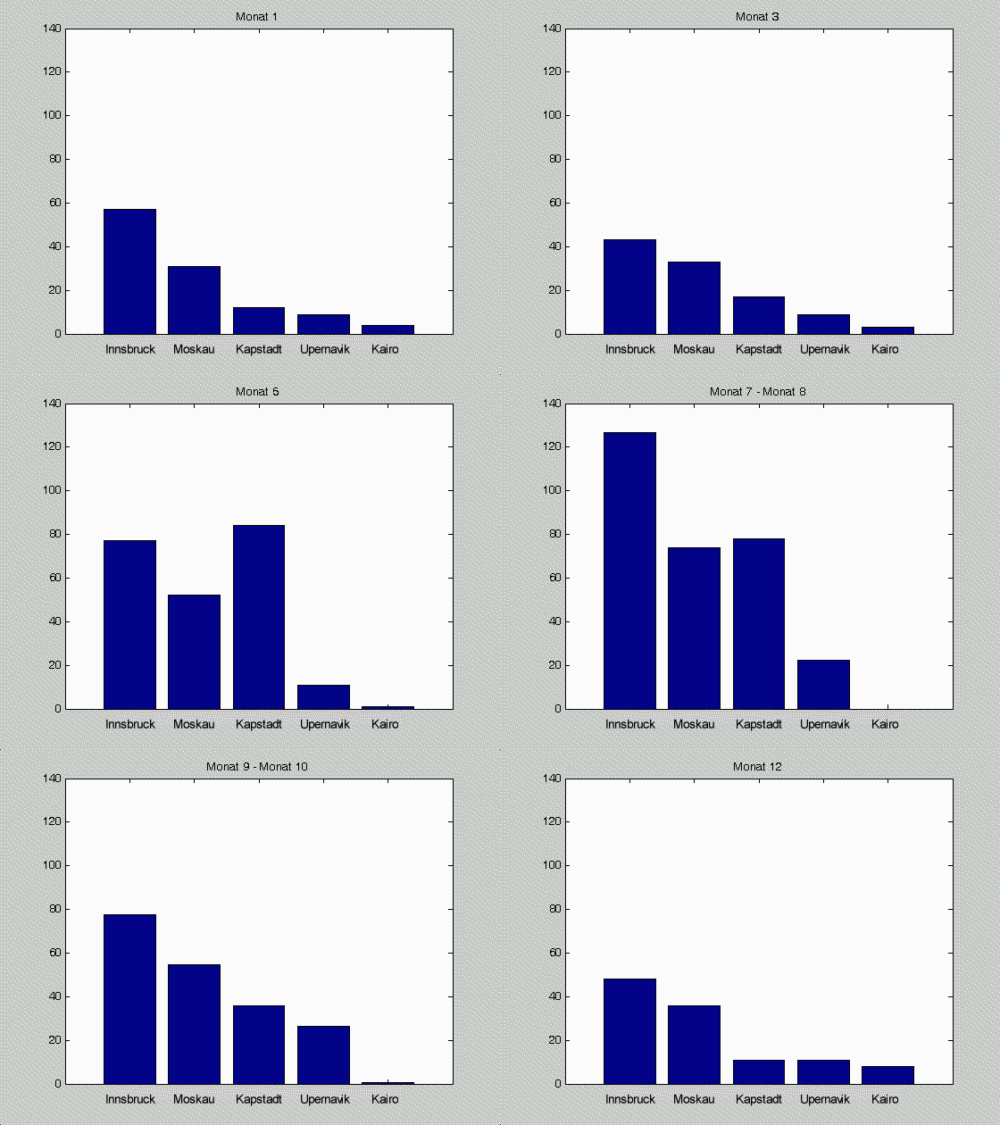
Picture 9: Visualisation by animation
In animations the time is no longer shown as an axis of the visualization. But an application that allows to interactively
move to specific moments in time provides a good insight into the
data at the selected moment.
In the playing animation the deviations and the absence of an attribute at a point
in time can be clearly seen. But the overview over the trends is lost. So in this case the ThemeRiver
could be favoured.
Two visualizations of the TimeHistogram
On www.VRVis.at a paper about the TimeHistogram can be downloaded. For the comparison with the ThemeRiver we chose two visualizations of this paper.
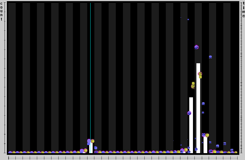
Picture 10: TimeHistogram - Point mode
For the point mode visualization the attributes (e.g. Innsbruck, Moscow, ...) are drawn on the x axis. On the y axis on the left side the attribute values are shown (e.g. rain in mm). On the right side the time period which is examined can be seen. The white bars show the values of the attribute for the chosen period of time like in the animation. With the program the period of time can be arbitrary manipulated. So for example the months June, July and August can be examined as a whole. An advantage of this visualization in comparison to the animation is that also information about the past and future trends is visible. This is shown in more detail in the next picture.
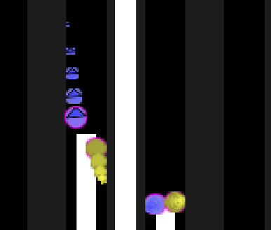
Picture 11: TimeHistogram - Point mode (detail)
For each bar points are shown. Yellow points for values of the past and blue points for future values. The size of the points indicates the time distance to the current measurements. Consequently small points represent values that lie in remote future or were measured long ago.
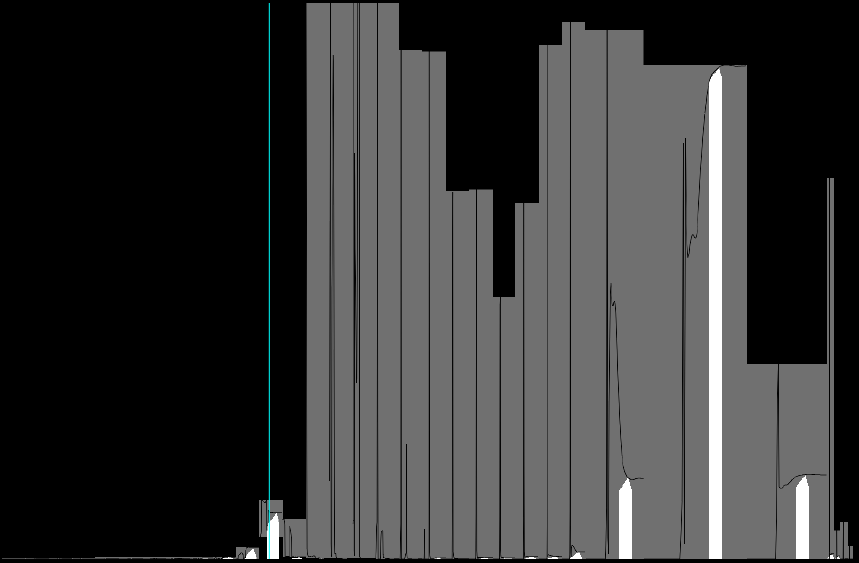
Picture 12: TimeHistogram - Line mode
The visualization in line mode shows again the attributes on the x axis
and their values on the y axis. In this case gray bars are drawn that
represent the sum of all attribute values over the time.
Within these bars the attribute values are drawn as function depending on the
time. For the currently chosen moment for each attribute a white bar
representing its current value is drawn.
In this way the current values are visible with white bars as well as trends
for the future and past.
| « Possible new features |